Silk Therapeutics website redesign
ROLE
UX/UI Designer + no-code developer
OVERVIEW
The Silk Therapeutics (ST) website is outdated, not responsive, and does not represent premium skincare. In 2019, I worked with an e-comm development team to make the site responsive and mobile-friendly.
Some background on Silk Therapeutics
Silk Therapeutics (ST) sells high-end anti-aging skincare products made with Evolved By Nature’s proprietary ingredient: Activated Silk™. They use only clean, natural ingredients and the products work.
ST relies on their repeat customers. People who try the brand, love it. But the brand awareness is not high and it’s a constant struggle to acquire new customers. We believed that by making the site look more premium, we would acquire new customers.
Site map + navigation
The navigation did not seem intuitive for consumers. I used LuckyOrange to see where customers are clicking and then I did some competitive research to compare the hierarchy of other skincare brands. There were several concerns I had about the navigation:
The Holiday Gift Guide was the first category on the top-tier nav. This linked to a long landing page of featured products that would be good as gifts. Not a bad concept, but it was not ideal to move this ahead of Shop in the primary nav.
No need to have Silk Therapeutics in the Shop category.
The different colors created a hierarchy that was not intentional. The categories in gray look less important that the categories in purple, pink or blue. This immediately creates a bias for the consumer.
For Professionals was a strange one to see. This linked to a page that was directed at Spa Owners and encouraged them to buy our products at wholesale price to sell in their spas. Yes, this was important for the business, but it didn’t deserve to be top-tier navigation.
The Blog was the least clicked category. Unfortunately, this was a category that the business owners were not willing to remove. It did help with SEO.
ST navigation from 2018. Needed to be updated.
Site map of 2018 website.
Design updates
Product pages:
Upgrade all product photos to remove the packaging, increase the size, include smears, human element and clinical results
Push tabs below the overall product description and add more valuable information: Clinical Results, Benefits, and a tab about what Activated Silk is.
Upgrade the Add to Bag section. If there isn’t an option for Scent or Size (this is the case for 90% of the products) then remove it.
Have the Quantity section become a dropdown instead of having to type in the number manually
Original design (left) and my design (right).
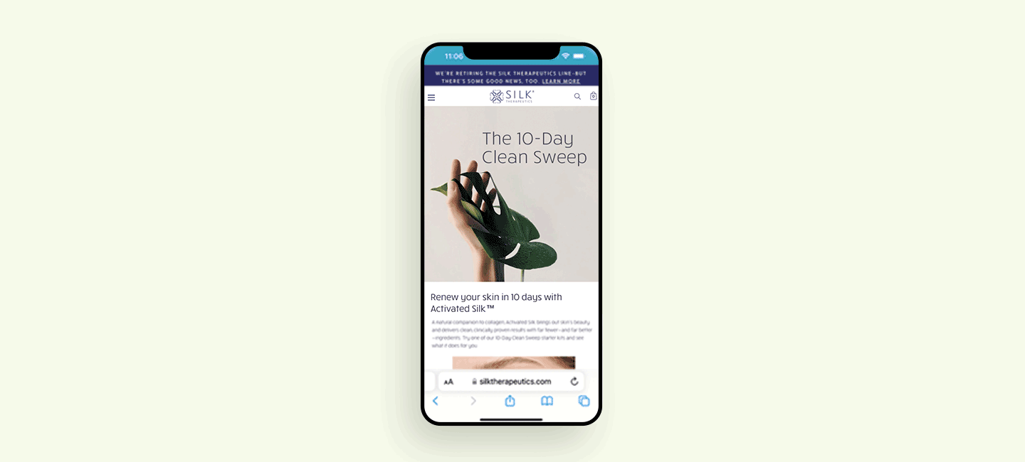
Homepage:
Eliminate the margins and make the site full width
Create a responsive hero that shrinks down to mobile size and uses live text
Include a “customer’s favorite” section that features one product per slide and include a description of what that product did (this was changed after launch because we found that it was too much reading and not enough choices)
Include a section about the benefits of ordering from our website like Free Shipping and Free Returns
The homepage has been through many iterations. We realized in user testing that people weren’t understanding what Activated Silk was and why it’s important. We have been testing different ways to highlight Activated Silk on the homepage and explain it in simpler terms.

Quick view + mini-cart:
The add to bag and checkout process on the original ST website was bad. Here is a typical customer journey:
You are browsing the Moisturizer section and you see Hydra-Rich and Nurture+. You wonder what the difference is, so you click on Hydra-Rich and it brings you to the product page.
You read about it and think it’s too expensive. You wonder how expensive was Nurture+? To find out, you have to go back (with the back button in the browser because there are no breadcrumbs) and click on that product.
Now you are on the Nurture+ page. It’s cheaper, so you want to add it to your bag and look for a cleanser to buy also.
RED FLAG: You click Add to Bag and it takes you to the bag! You’ve lost your place! Since there are no breadcrumbs, you have to start all over again.
This had to change. I did a lot of research on how other skincare brands treated their shopping bag experience. I decided that a Quick View on desktop would be a great solution for users to get a quick look at the description, but can stay on the collection page. I decided to add the Mini-Cart because of the same situation. This Mini-Cart allowed the user to see their total, see when they achieve free shipping, can remove items, and easily begin the checkout process.
The Mini-Cart feature increased customer add to bag behavior by 40% and increased average conversion by 10%. The conversion rate was not as high as we anticipated but through user testing, we discovered it was because of the high average cost of each product. **Our AOV is over $125
Mini-cart user flow
Conclusion
The ST redesign was my first real world project as a UX designer and it was challenging, but very rewarding. I learned a lot about e-commerce and was able to navigate the website using apps and templates in Shopify without an in-house developer. The updated customer journey I created helped new customers convert to repeat customers. Since this redesign in 2019, we hired a visual designer to join the team and did a brand refresh in 2021. Unfortunately neither design was enough to save Silk Therapeutics and the brand announced their retirement in June 2022.