
GENERAL ASSEMBLY Project: Wells Fargo
Create a new app/feature for an existing brand that re-imagines how users consume content on a daily basis.
Problem
Wells Fargo currently has information and tools related to home buying on their native application, but they are considered inefficient and ineffective. They are looking to improve these features, especially for first time home buyers.
Solution
We believe that by designing a Homebuying Guide feature with a variety of educational and organizational tools, such as a calculator and structured checklist, users will feel more comfortable navigating the process.
Duration: 2 week sprint
Team: Tom, Shauna, David, and myself
Platform: iPhone
Tools: Sketch, Axure, InVision, Photoshop, and InDesign
The Wells Fargo app
The current Wells Fargo app is a hybrid app, which we found to be problematic. When searching for information regarding the home buying process, the user needs to navigate through 3 levels just to be able to get to the information they want. Once they reach the Mortgage Loans category, the app boots the user over to the browser. We knew immediately that we needed to change that.
Another problem we encountered was with the hierarchy. Wells Fargo primarily focuses on banking and so that information was put in front and center on the app. We wanted to change that and make the home buying feature the center of the app.
Who is our user?
Unfortunately, no one on my team owned a home. This caused an added level of discomfort with determining our audience. We did not know what the steps are in the home buying process, so we need to figure that out in order to advise others. We decided to interview 2 groups of people: home owners and potential home buyers.
We sent out a screener survey to friends, family, and colleagues that we thought would fit the mold.
We interviewed the people who responded well to our screener survey and we even created 2 separate discussion guides to ask the different groups.
Used affinity mapping to target pain points and user needs.
Created 2 personas using the information we gathered.

Personas
We decided to create two personas to encompass the two types of users we hope to attract. One persona is a young, successful woman who saved enough money to buy her own place. And the second persona is a couple buying their first home because they need more space for their growing family.
Takeaways from user research
Buying a home is very stressful.
Almost everyone needs to take out a loan in order to buy a home.
People are uncomfortable with the buying process.
Zillow is the most well-known home buying app.
Sketching begins
To start the design process, we used the design studio method to get all of our ideas onto paper. This method involves a team where you set a goal, and then each person sketches for about 5 minutes. You want to sketch out between 6 and 8 screens. After that, everyone critiques each other's sketches and then the team decides what the best ideas are. Once decided, you implement the ideas and later refine them.
We walked away from our first design studio with a lot of great ideas. We knew we wanted to have a few things:
A budget calculator for the user to have as a starting point
A checklist that tracked the process
Pop-ups with helpful information about the subject matter
Feature Analysis
So how do we use all the information we gathered from research? We brainstormed some feature ideas to help make the home buying process more approachable, easier to track, all the while providing helpful information for those who were unfamiliar with the steps.
HOMEBUYER'S GUIDE app map
We really had to narrow the scope of the current Wells Fargo app map in order to get a map that makes sense for our feature. We decided to cut out anything about banking in order to make it easier to navigate for our users.
User flows
We came together with a solid design so we underwent our first user test and it did not go as planned. The user was confused by the budget calculator and the slider feature. The user also did not start by clicking on the checklist, which is what we assumed would happen.
We had to rethink our design. So we went back to our personas and tried to refine our user flow.
Transition from main app flow into Homebuyers’ Guide. This was the on-boarding to inform users how to navigate the app.
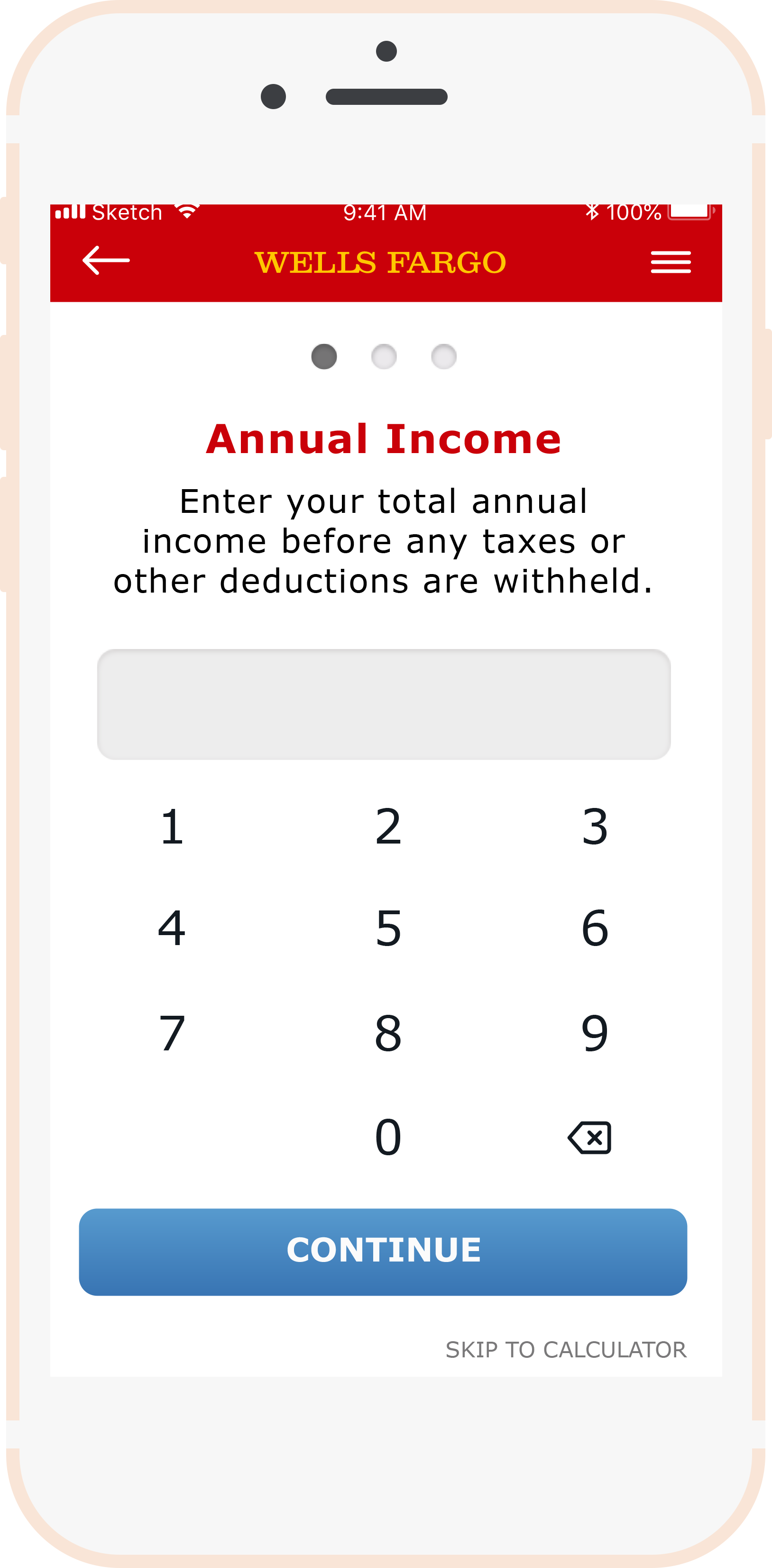
This is how the user would move through the budget calculator. We decided to ask important budget questions before showing the calculator as a way to minimize information overload.
The prequalification flow was a bit more complicated because forms naturally lead to heavy railroading. Ability to return to checklist or the dashboard.
hi-fidelity screens
After nailing down what our user flows looked like, we were ready to bring our paper wireframes into Sketch. We each designed a few screens on our own and came together with our ideas. I created a basic style guide for Wells Fargo so we would all use the same colors and type.


USER TESTING #1
Our first user test was a major learning experience for the team. We assumed that our user would start by clicking on the calculator tool, when in fact they clicked on the checklist. The user did not love the slider element of the Affordability Calculator. They said it was hard to read. The user also suggested we add a section that pertains to checking your credit score. This was an idea that we had not even thought of, so the feedback was helpful and we decided to implement a credit score feature that allows the user to check their credit score on CreditKarma.com.
USER TESTING #2
The second user test proved much better. The user was able to navigate the prototype without any major hiccups. A few of the takeaways are as follows:
Need to either emphasize the button aspect on the checklist because the user did not know it was clickable
The font size is too small, we need to increase it
Should have an option to put in a dollar amount instead of only a percentage when filling out the down payment section of the Affordability Calculator
The pie chart on the Affordability Calculator looks nice, but it isn't very functional
