GENERAL ASSEMBLY PROJECT: Drizly
Create a recipes page for the current mobile app.
Problem
Our client currently struggles to convert sales through the use of their recipe page due to the lack of availability on the Drizly mobile app.
Solution
By creating a recipes section in the mobile app, we believe the current conversion rates will increase.
Duration: 3 week sprint
Team: Ryan, Tali, Kevin, and myself
Role: Designer of wireframes, UI and prototypes
Platform: iPhone
Tools: Sketch, InVision, Photoshop, and Illustrator
What is Drizly?
Drizly is the world's largest alcohol marketplace and delivery service that connects the customer to the liquor store. Drizly promises the best prices compared from the nearest stores in your location as well as delivery to your personal residence or business in under 1 hour. Drizly works with local stores so you can shop their shelves using your smartphone or computer to order beer, wine and liquor at the touch of a button.

FINDING Recipes on the Drizly mobile website
Drizly has a recipes page on their desktop website as well as their mobile website. However, the recipes page was nonexistent from the mobile app and our client said that most of their orders come from the mobile website, rather than the mobile app. We decided to use this information and take the basic design of the current recipes page and add it to the mobile app. We believe this would result in high conversion rates.
After studying the mobile website, we realized that the recipes page was buried within the navigation. The path of getting from the homepage to a recipe product page was long and a bit misguided. We wanted to simplify this process in the mobile app version so that users would be able to find recipes faster. Below is the path on the current Drizly mobile browser.
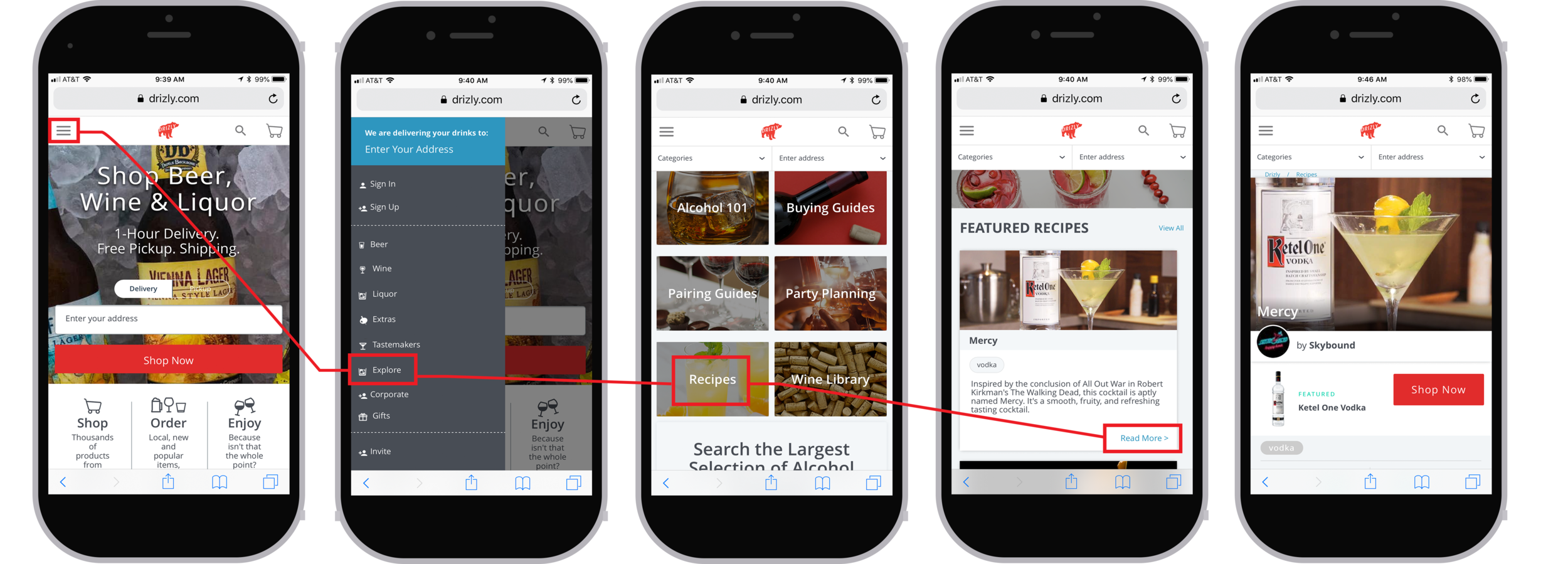
Current path from the mobile homepage to a recipe product page.
Project plan
After our first conversation with our contact at Drizly, my team and I got together and created a project plan. This project was different from all the other General Assembly projects not only because it involved a real client, but also because it would be three weeks long rather than one or two. We had to consider this when developing a plan.
TIME TO INTERVIEW
We knew that Drizly was seeing foot traffic on their recipes page, but we needed to find out why people were looking at recipes and not buying the ingredients. We sent out a screener to many people in order to narrow down the interview candidates. We wanted to interview people that drink alcohol and enjoy trying new recipes. We decided to focus less on who has used Drizly, and more on the people who search for recipes online. After sending out surveys and interviewing potential users, we did affinity mapping to gather information and find trends.
Affinity mapping trends
Most people want to make their own mixed drinks rather than order pre-made mixed drinks.
Almost all of the users search for drink recipes in preparation for a special occasion.
Everyone has a favorite mixed drink and none of the users shared the same favorite drink.
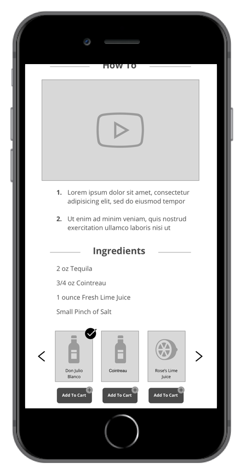
Most people are visual learners and like to see large photos and even videos alongside the recipe.
Almost all of the users look up recipes on their phone as opposed to a desktop computer.
Sketching begins
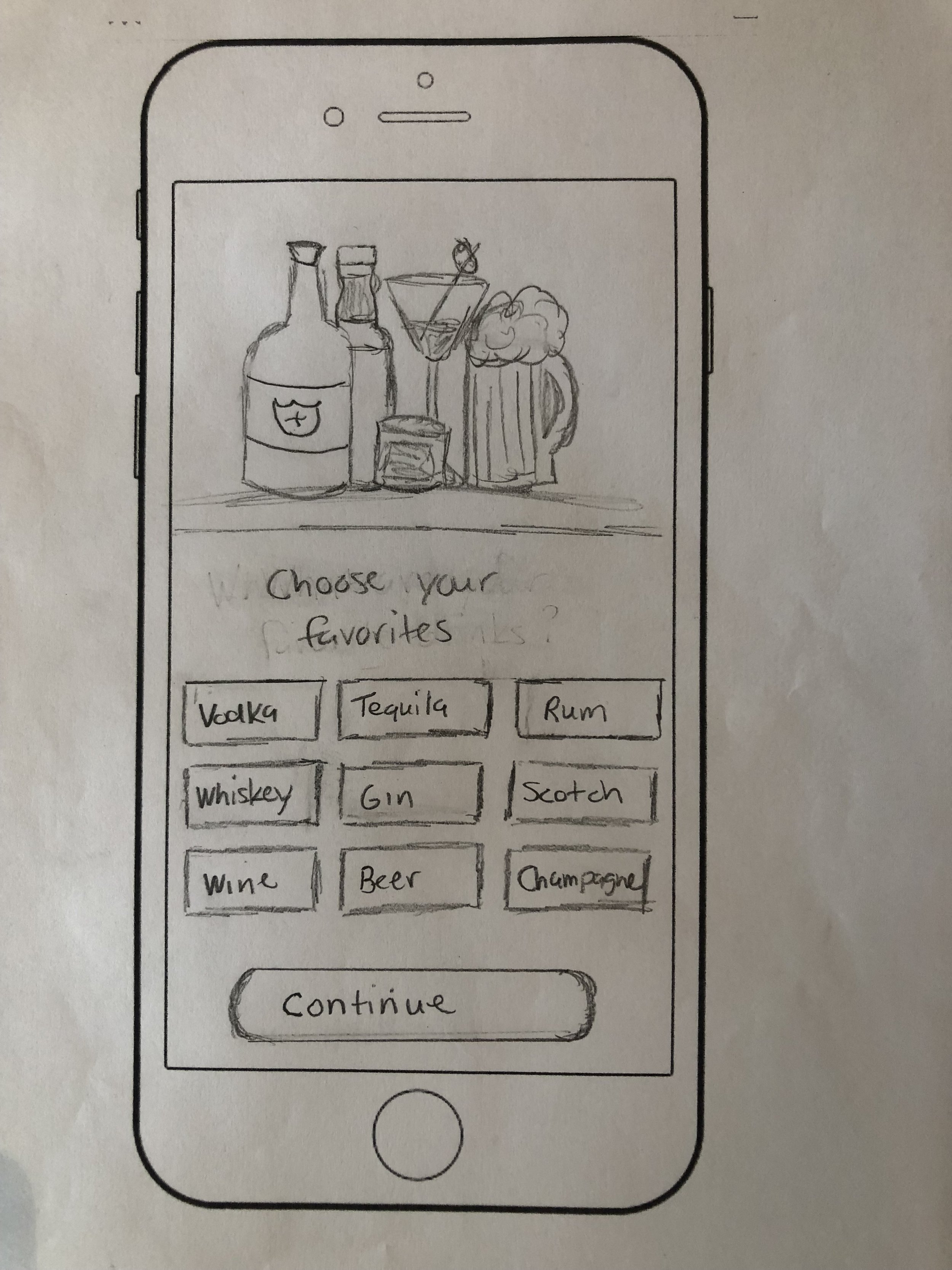
We had a lot of great ideas on how to add the recipes to the Drizly mobile app. We wanted to take their current recipes section from the mobile browser version and enhance it. We knew we wanted to add how to videos and large photographs of the drinks. We wanted to simplify the process of finding a drink by adding a recipe link on the homepage. And a major change we thought would be beneficial is to add an onboarding portion into the app that asked the user what their favorite types of alcohol were and from there, Drizly would find top recipes for the user, which would hopefully make them more inclined to buy.


PAPEr prototype testing
We used our paper sketches in our first prototype test. Overall, the testing went well and the users enjoyed the experience. Although we were early in the development stage, we got a lot of good feedback and heard some ideas that we implemented right away.
In the onboarding section, we decided to add a SKIP option for people who didn't want to key in their favorite alcohols.
We added an option for guests to use the app, rather than making the user sign up initially.
We thought about adding a section of "top brands for you" that would be based on the onboarding choices.
Users liked the option to add all recipe ingredients to the cart at one time.
Our first client meeting
At the end of week one, we agreed to present our work to the client. So we brought our sketches and the information gathered from research. The client liked what they saw, but they wanted to know how the user would go from searching recipes on Google to searching on their native app.
We regrouped and thought about this for a while. We came up with four ways to get the user to move from Google to the app. After sketching out these ideas, we did A/B testing to determine which method was best. Although we got some mixed reviews, it became it clear that people liked to see the "download app" feature at the bottom of the screen.

Nobody liked the smart banner at the top.

"Open in App" button is static at bottom of screen.
USER FLOWS
So now that we had a general idea of what we wanted to make, it was time to work on the user flows. We created one flow for the user that would download the Drizly app organically and one flow for the user who would Google a specific recipe.
Wireframes
Once the user flow was nailed down and some initial testing was done, we moved into wireframes. This process was pretty seamless. We split the workload evenly and all worked on specific screens using Sketch. The idea we had come up with was coming to life.


Back to the client
We created a clickable prototype from our wireframes that we planned to present to the client on week 2. At this point, we had tested the prototype twice and had some tweaks we wanted to make, but thought we would make them after the client meeting. During this session, we met with our contact at Drizly who is the UX Designer, two product managers, and a web developer. The prototype was well received. The biggest takeaway was that the product managers did not like our idea of minimizing the product page to a lightbox. Although we had no complaints of this in user testing, we later chose to listen to the client and so we eliminated the lightbox and stuck to the "quick add to cart" concept that was already in place on the Drizly mobile site.

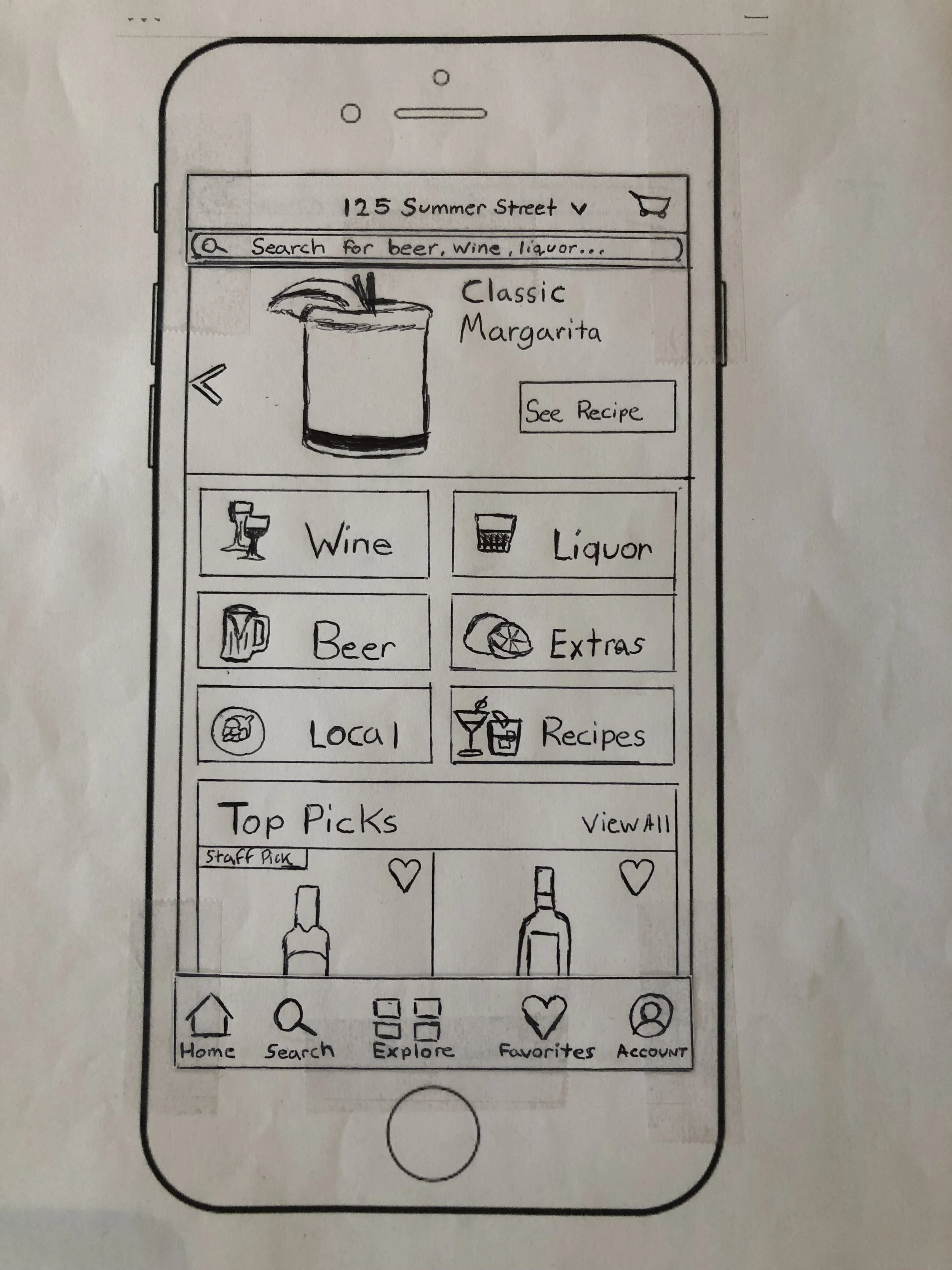
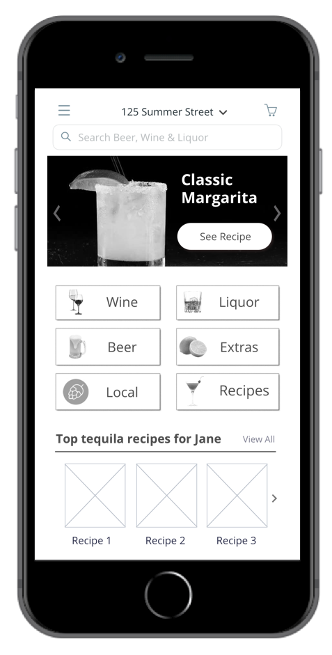
One of the bigger challenges I faced when designing the screens for Drizly was adding the recipes category to the main page of the app. Our initial idea was to remove a section that was labeled "Deals," but the folks at Drizly said that they did not like that idea since the “Deals” section got a good amount of traffic. So I reorganized the page so that there was a clear, horizontal list of options that included "Deals" and "Recipes." Everybody wins! And the client loved it.
Drizly mobile app home screen before redesign.
Redesigned Drizly mobile app home screen with clear navigation that includes a recipes section.
MORE USER TESTING
As we entered into week three, we felt confident about what we created. We thought the idea was simple, but effective. Plus, we knew that the client was happy with the path we went down. After testing the low fidelity prototype a few more times, we chose to implement a few other changes before diving into the high fidelity screens.
Need to clarify on what the "Top Picks" on the recipe page would consist of.
Add arrows on the carousel at the top of the recipes page.
Wanted to know if an ingredient was unavailable without having to click on it.
Consider adding a section like "More recipes like this" in the shopping cart.
HI-FIDELITY SCREENS
Since I have graphic design experience, I offered to do a lot of the UI design. We were given a style guide by Drizly and I followed that guide to keep the colors consistent. The idea was to enhance the design of their mobile site and not do a total redesign.
Wrapping Up
We presented once at the Drizly site and then again at General Assembly. Both presentations went very well. The client was happy and told us that they plan to implement some of our ideas in the future. Our team was super proud of what we accomplished in such a short time. Had we been given more time, we proposed another idea that was a "Make Your Own Drink" section of the Drizly app. Rather than having to search for a drink recipe, with this feature the user could make their own drink recipe. If the user has a bottle of Kahlua laying around the house, you could enter that type of alcohol and find recipes that include Kahlua. Or you could create your own special drink and the app would suggest other ingredients. The client liked this idea as well, but was very content with the prototype we delivered.
FINAL PROTOTYPES
Drizly prototype - USER FLOW #1
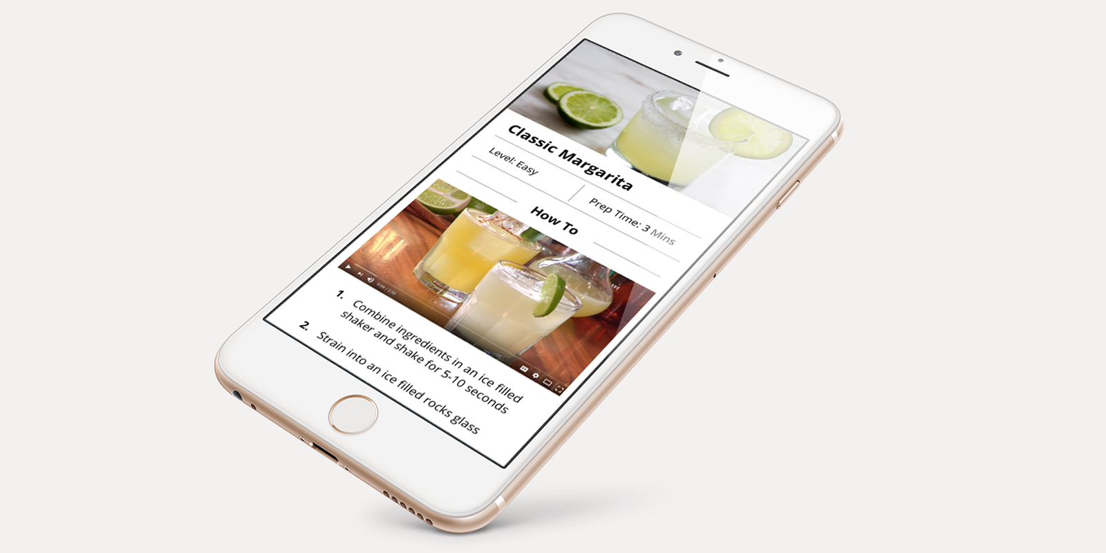
This first prototype demonstration is our first user flow. This would be when the user is searching for a specific drink recipe on Google and comes across a Drizly recipe. The user would then download the app and be directed right to the recipe. This user flow does not include the onboarding process, nor does it include the sign up process.
Drizly prototype - USER FLOW #2
This alternate prototype demonstration is our second user flow. This would be when the user find the Drizly app organically. Maybe they heard about it from a friend, or found it browsing the app store, but they decide to download the app and sign up. This is just a quick demonstration of how the onboarding process would go.